When it comes to designing or re-designing a website, it can be easy to get hung up on the aesthetics. "That shade of blue just doesn't look right .... Wouldn't it be cool to have the logo on the right side of the screen? .... How about we put a giant animated GIF in the middle of the page?"
However, if you're truly trying to accomplish something with your website (e.g., brand awareness, lead generation, etc.), you'll need to focus on more than just how your website looks.
LEARN ABOUT THE POWER OF GROWTH DRIVEN WEB DESIGN. DOWNLOAD IT HERE.
In a world where folks have more than a billion websites they can potentially land on, you need to make sure your website's design is optimized for usability (how easy your website is to use) and user experience (how enjoyable interacting with your website is for actual users).
Now, you could spend years studying the ins and outs of usability and UX, but for the sake of giving you a jumping off point, we've put together the following list of helpful guidelines to apply to your next web design project.
8 Website Design Guidelines for an Exceptional User Experience
1) Simplicity
While the look and feel of your website is important, most visitors aren't coming to your site to evaluate how slick the design is. They're coming to your site to complete some action or to find a specific piece of information.
From a usability and UX perspective, simplicity is your friend. And you can employ simplicity in a variety of different ways. Here are some examples:
- Colors. Don't use too many. The Handbook of Computer-Human Interaction recommends using a maximum of five (plus or minus two) different colors in your website's design.
- Typefaces. The typefaces you choose should be legible at varying sizes at the very least. And when it comes to fonts, you shouldn't use too many. A common recommendation is to use a maximum of three different typefaces in a maximum of three different sizes.
- Illustrations. Only use them if they'll help a user complete a task, elucidate a point or perform a specific function.
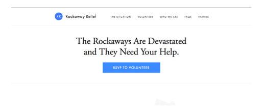
Here's a great example of a simple homepage design from Rockaway Relief:
2) Visual Hierarchy
Closely tied to the principle of simplicity, visual hierarchy entails arranging and organizing website elements so that visitors naturally gravitate toward the most important elements first.
Remember, when it comes to optimizing for usability and UX, the goal is to lead visitors to complete a desired action, but in a way that feels natural and enjoyable. By adjusting the position, color, or size of certain elements, you can structure your site in such a way that visitors will be drawn to those elements first.
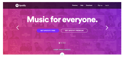
In the example below from Spotify, you can see that the "Get Spotify Free" call-to-action sits atop the visual hierarchy. For starters, it's positioned on the left of the page (most visitors scan websites from left to right). What's more, it's the only element above the fold that uses that dark purple color, which naturally draws your attention.
3) Navigability
Having intuitive navigation on your site is crucial for ensuring visitors can find what they're looking for. Ideally, a visitor should be able to arrive on your site and not have to think extensively about where they should click next -- moving from point A to point B should be as pain-free as possible.
Here are a few tips for optimizing your site's navigation:
- Keep the structure of your primary navigation simple (and near the top of your page).
- Include navigation in the footer of your site.
- Use breadcrumbs on every page so people are aware of their navigation trail.
- Include a search box near the top of your site so visitors can search by keywords.
- Don't dig too deep. In most cases, it’s best to keep your navigation to no more than three levels deep. (Check out this article for more clarity around flat vs. deep navs.)
- Include links within your page copy, and make it clear where those links lead to.
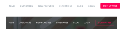
Another pointer: Once you've settled on what your site's main (top) navigation will be, keep it consistent. The labels and location of your navigation should remain the same on each and every page of your site. Here's an example from the InVision website:
And this leads us to our next principle ...
4) Consistency
In addition to keeping your site's navigation consistent, the overall look and feel of your site should be consistent across all of your site's pages. Backgrounds, color schemes, typefaces, and even the tone of your writing are all areas where being consistent can have a positive impact on usability and UX.
That's not to say, however, that every page on your site should have the same exact layout. Instead, you should create different layouts for specific types of pages (e.g., a layout for landing pages, a layout for informational pages, etc.), and by using those layouts consistently, you'll make it easier for visitors to understand what type of information they're likely to find on a given page.
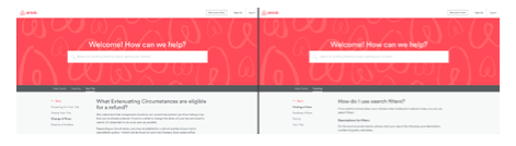
In the example below, you can see that Airbnb uses the same layout for all of its "Help" pages (a common practice). Just imagine what it would be like from a visitor's perspective if every "Help" page had its own, unique layout. (It would likely result in a lot of shoulder shrugging.)
5) Accessibility
According to comScore, tablet internet consumption grew 30% between 2013 and 2015. Smartphone internet consumption, meanwhile, grew 78% during the same time period. The takeaway here: In order to provide a truly great user experience, your site needs to be compatible with the different devices (and operating systems, and browsers) that your visitors are using.
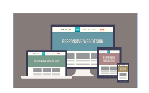
At a high-level, this means investing in a website structure that is highly flexible -- like responsive design. With a responsive site, content is automatically resized and reshuffled to fit the dimensions of whichever device a visitor happens to be using.
At a lower level, improving accessibility can be as simple as adding alt-text to all of your images (so visitors who can't see images in their browsers can still understand what's on the page).
Ultimately, it's more important that your website provides a great experience across different platforms as opposed to having to it look identical across those platforms. And that can mean adhering to platform-specific design conventions instead of trying to squeeze in unique elements that users of that platform might not be familiar with.
This leads us to our next principle ...
6) Conventionality
There are certain web design conventions, which, over the years, internet users have become increasingly familiar with. Such conventions include:
- Having the main navigation be at the top (or left side) of a page
- Having a logo at the top left (or center) of a page
- Having that logo be clickable so it always brings a visitor back to the homepage
- Having links change color/appearance when you hover over them
While it might be tempting to throw all such design conventions out the window for the sake of being completely original or unique, this would (likely) be a mistake. It'd be akin to putting a car's steering wheel in the backseat, which is to say: it would confuse people.
In order to provide the best experience possible for your site's visitors, take advantage of the fact that you already know what types of web experiences they're familiar with. You can use this information to make your site easier for visitors to navigate.
One of the most common examples of conventionality in web design: Using a shopping cart icon on an ecommerce site:

In the image above, you can see (from left to right) shopping cart icons from Amazon, Wayfair, and Best Buy.
7) Credibility
Ultimately, using web design conventions -- design elements and strategies that visitors are already familiar with -- can help give your site more credibility. And if you're striving to build a site that provides the best user experience possible, credibility (a.k.a. the amount of trust your site conveys) can go a long way.
One of the best ways to improve your site's credibility is to be clear and honest about the product/service you're selling on the site. Don't make visitors have to dig through dozens of pages to find out what it is you actually do. Instead, be up front about it, and dedicate some real estate to explaining the value behind what you do.
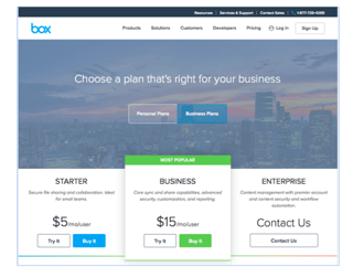
Another credibility tip: Have a pricing page. While it can be tempting to force people to contact you in order for them to learn more about pricing, having prices listed clearly on your site can definitely make your business seem more trustworthy and legitimate. Here's an example of a great pricing page from the Box website:
8) User-Centricity
At the end of the day, usability and user experience hinge on the preferences of the end users. (After all, if you're not designing for them ... who are you designing for?)
So while the principles detailed in this list are a great starting point, the real key to improving the design of your site is to conduct user testing, gather feedback, and make changes based on what you've learned.
Here are a few user testing tools to get you started:
- Crazy Egg. Use this tool to track multiple domains under one account and uncover insights about your site's performance using four different intelligence tools -- heat map, scroll map, overlay, and confetti.
- Loop11. Use this tool to easily create usability tests -- even if you don't have any HTML experience.
- The User Is Drunk. Pay Richard Littauer to get drunk and review your site. Don't believe me? We tried it. Check it out.
According to Vitamin T, 68% of visitors fail to convert because they don't think you care about their experience. So as a final bit of usability/UX wisdom, start caring more! Put yourself into the shoes of your site's visitors and keep them in mind every step of the way.