To new visitors, your website is uncharted territory. Navigation makes it easier for your potential customers to find the information they’re looking for and make a purchase. Making it easy to buy increases your conversion rates.
In this report, eConsultancy analyzes research on what gets e-commerce shoppers all the way through to the end of the checkout process. The report also suggests best practices for e-commerce sites, and improving navigation is at the top of their list.
With that in mind, here are Five Tips to improve navigation in your redesigned website.
1. Breadcrumbs
Just as in Hansel and Gretel, digital breadcrumbs leave a trail show your website visitor the path they’ve traveled.
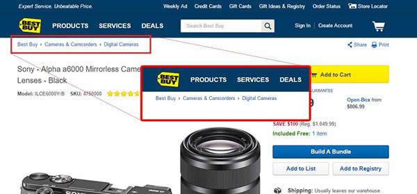
An easy to follow and coherent site hierarchy helps your visitors know where they’re going and where they’ve been. It also helps lead them to what YOU, the site owner believe is most important. Adding breadcrumbs to your website redesign provides an instant link that visitors can click to quickly jump back to a previous category.
2. Web Design Standards
Websites, specifically e-commerce, share design standards that customers have come to expect. Even with your own website redesign, it’s best not to try to reinvent the wheel. Visitors will expect to see menu bars horizontally at the top of the screen or vertically on the left side of the screen. Shopping cart and checkout options usually appear in the top right with a picture of a literal shopping cart.
Research from the Nielsen Norman Group reports that, because people read left to right, the first thing your visitors will do is quickly scan down the left side of your site, looking for lists and navigation menus. The report also discourages any right-aligned menus. Any aesthetic value those menus might have is counteracted by a decrease in usability for your visitors.
3. Limit Clicks
Many web designers use a “Three Click Rule,” which dictates that a visitor should be able to reach the information they’re looking for in three clicks. If you want to truly simplify the browsing process for your new site, this means that each page or category on your website should be reachable in three clicks or less.
4. Limit Confusion
While your website’s different buttons and menus options help your visitor, it is possible to have too much of a good thing. A long menu with every page on your site overwhelms visitors. To correct this, if you remove some of the menu options, the remaining options visually stick out more.
Instead of inundating your potential customers, try grouping your site into categories in the navigation menu. Within those categories, include five to seven sub-categories or content pages about the main category.
5. Create an SEO Foundation
Despite the fact that PageRank is no longer visible, SEO still matters. Good site navigation also supports Search Engine Optimization (SEO). You want to be easy to find when people go searching for specific products and industries on sites like Google or Bing.
4 Things You Don't Know About SEO
If you want your page to come up when people are using search, make sure that the navigation labels in your website redesign contain keywords that repeat throughout the page. By cleaning up your site with categories and sub-categories as discussed, each link also becomes more relevant.